Balancing the height of mobile product list items with the overall number of visible products isn’t a superficial change, it is a fundamental usability element influencing conversion rates, customer satisfaction, and on-site engagement. Designers and e-commerce teams must carefully adjust the user’s visual load, scrolling effort, and scanning ability by paying close attention to list item dimensions. Mobile product discovery naturally challenges users with limited screen space, fatigue from repetitive scrolling, and the need to quickly understand available choices. The height of each mobile list item, how many appear above the fold, and the loading strategy behind them all work together to shape browsing behavior and conversion outcomes.
Recent studies show that slight changes to mobile list item height, width, and the number of items loaded at once can greatly reduce cognitive strain, maintain user interest, and increase the chance that users review enough relevant products before fatigue occurs. At the same time, adaptive and intelligent loading techniques affect performance, perceived site speed, and even abandonment rates, highlighting that this seemingly narrow detail has broad business effects.
Psychological Foundations
Mobile users operate under strict, instinct-driven limits. Cognitive load theory indicates that the human brain can only process a limited amount of new information simultaneously; when faced with overly tall list items or endless product catalogs, shoppers experience cognitive overload. This mental exhaustion shows up as reduced attention spans, diminished recall of earlier products, and eventual disengagement, directly leading to lower conversion rates and higher bounce.
User fatigue increases when mobile product lists exceed comfortable lengths. The scrolling motion itself, repetitive and lacking visual landmarks, can become tedious, causing users to scan less carefully or abandon lists before finding a suitable product. Behavioral studies reveal that when users feel the effort outweighs the reward, too much scrolling, insufficient actionable information, or unclear variety, they tend to return to search, filter again, or exit.
Visual hierarchy and information density guide how quickly and confidently users scan lists. Overly tall list items may include unnecessary product details but hide variety, requiring excessive scrolling that disperses user focus. On the other hand, items set too short cram information, causing hesitation and extra taps to reveal hidden content. Achieving the right balance in item height and preview detail aligns with Fitts’ Law and Hick’s Law, enabling quick, meaningful choices without mental strain.
Above-the-fold content is particularly influential on mobile. Users form snap judgments about content quality based on the first visible items; if list items are so tall that only one or two appear, users may feel the options are too limited or effortful to access. Alternatively, several compact items above the fold communicate abundance, encouraging interaction without overwhelming.
Balancing List Item Height, Visible Range, and Engagement
Limiting List Item Height to Encourage Scanning and Exploration
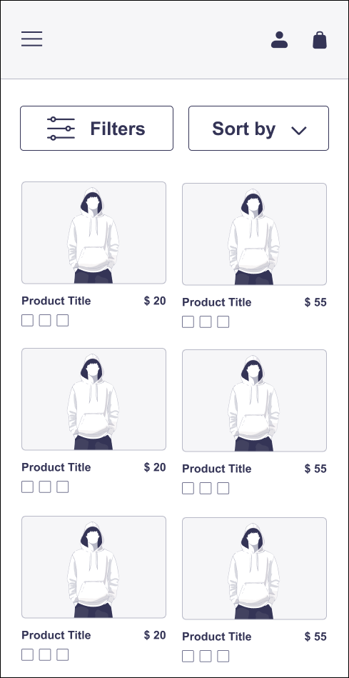
Restricting the height of each product list item on mobile to no more than half the vertical screen size in portrait mode usually ensures that at least two distinct choices are visible at once. This setup directly supports comparative scanning, a cognitive process humans excel at visually, allowing users to make side-by-side micro-comparisons with minimal scrolling. When only one large item fills the viewport, users subconsciously sense a lack of diversity, even if many items lie below. Seeing multiple products at once reassures the user of a meaningful selection, reducing bounce caused by perceived scarcity.
Usability testing shows that when mobile product cards exceed half the viewport height, engagement metrics decline. Participants get fatigued, slowly scrolling without noticing new product options. Analysis of scroll depth and dwell time indicates that very tall items correlate with shallower engagement and faster list abandonment.
Optimizing the Number of Loaded Products Per Page
Loading between fifteen and thirty product list items per set matches well with observed user endurance on mobile platforms. This upper limit prevents lengthy initial load times, enabling fast interaction and exploration. When teams surpass that threshold, especially with image-heavy product grids, users face more friction: loading spinners, delayed image rendering, and increasingly laggy scrolling, all undermining the immediate engagement needed to hold interest. Conversely, showing fewer than fifteen products risks an underwhelming experience. Users are forced into frequent load-more actions that disrupt flow, fragment scanning, and segment what should feel like a seamless selection.
Testing demonstrates that visually oriented product categories, like apparel or home décor, lean toward the higher end of this range, since users quickly assess options based on thumbnails. Spec-driven products, needing more text and feature comparison, work better at the lower end, as mental demand builds with each item reviewed.
Width and Content Density: Improving Comfort and Readability
When screen width permits, organizing mobile lists as single-column layouts with moderate width boosts user comfort. Overly narrow list items create excessive text wrapping, reducing readability and making side-by-side attribute scanning more difficult. Trying to fit multi-column product cards on narrow screens shrinks tap targets and invites input mistakes. Ensuring items have just enough width for their main thumbnail, product name, and price or rating eases both physical and mental navigation.
Within each card, focusing on key information, thumbnail, short title, price, and rating, at a glance supports rapid evaluation. Details requiring slower, deeper reading (discounts, shipping info, extended specs) perform better tucked into quick views, expandable sections, or secondary pages. This hierarchy aligns with Miller’s Law, minimizing working memory effort for initial scanning.
The Role of Above-the-Fold Content in First Impressions
The initial viewport sets the tone for the entire browsing session. If only a single oversized item appears at page load, data shows bounce rates increase noticeably. When at least two or three complete product options are visible above the fold, users receive clear visual cues of abundance and variety, boosting dwell time and scanning depth. This principle guides successful first-impression strategies across top retail apps, front-loading lists with compelling product images, special offers, or best sellers, while keeping item heights compact enough to show several choices instantly.
Making sure the above-the-fold area contains complete, self-contained product cards rather than partial or unfinished items also enhances perceived polish and trust.
Adaptive and Dynamic Sizing: Fitting Device and Orientation
The current device market includes a wide variety of mobile screen sizes and aspect ratios. Fixed sizing creates poor experiences: what fits well on a typical smartphone may break on a mini-tablet or foldable screen. Responsive logic that adjusts list item height and width based on screen size, not just for mobile versus desktop but per device, ensures optimal information density. On tall, narrow screens, items might be slightly shorter, allowing more vertical browsing before loading pauses. In landscape mode, where more horizontal room exists, maintaining moderate heights preserves usability without creating large empty spaces.
By dynamically setting maximum list item height to always show at least two products on screen in portrait, designers avoid common frustrations related to “ghost swiping”, the irritation users feel when forced to scroll past empty or partial content.
Smart Loading and Performance Optimization
Lazy Loading and the “Load More” Pattern
Applying lazy loading and “Load More” tactics aligns page performance with natural user exploration. Instead of downloading all products upfront, which overloads mobile memory and stalls interaction, items appear only as the user approaches their on-screen position. This method, whether using a Load More button at segment ends or auto-fetching sets as the user nears the bottom, matches data transfer with attention, conserving bandwidth and preventing bounce caused by perceived slowness.
It is essential that smart loading does not interrupt navigation. The browser must reserve vertical space for incoming items with placeholder blocks matching product card size. Preemptive layout control ensures new data arrival does not cause interface jumps, stutters, or unexpected shifts, preserving tap target stability and the mental spatial “map” users depend on. If loading triggers too late, users see spinners; too early, and smooth scrolling rhythm breaks as batches appear unpredictably.
Asynchronous Thumbnail Loading
Another common technique loads structural elements of every list item, text, price, ratings, immediately, while fetching images asynchronously. This sequence offloads heavy assets (thumbnails), letting users begin scanning options at once, with visuals filling in as attention moves down the list. Prioritizing above-the-fold thumbnails and gradually loading those further down preserves the impression of instant speed, reducing actual and perceived load times without losing visual context.
This approach also supports progressive enhancement for accessibility: text and basic controls are available immediately to assistive technology users, even if images load more slowly.
Application Examples
Mobile shopping apps for fashion goods commonly use list items slightly under half the screen height in portrait mode, ensuring at least two full products are visible simultaneously. This method guides shoppers smoothly through hundreds of products, lessening cognitive fatigue from endless vertical scrolling. Each item highlights core features, a clear image and price, while brief descriptions and secondary actions appear in a fold-out quick view or overlay. This hierarchy lets users scan dozens of options quickly before focusing on details.
In grocery delivery interfaces, list items stay compact with moderate width, avoiding text wrapping and enabling side-by-side comparison of nutrition labels or prices. The Load More button appears after twenty items, signaling more options without overwhelming shoppers with too many on-screen products. A reserved white space beneath the list, sized for the next batch, prevents layout shifts and keeps the footer accessible.
A mobile electronics store employs adaptive sizing, shrinking item cards on smaller devices so two products remain visible in any orientation. When users turn the screen, the layout adjusts width to keep a single column but grants items extra space. Images load progressively based on scroll distance; above-the-fold thumbnails appear immediately, while those further down fade in as users scroll, maintaining performance without abrupt content changes.
Hotel booking platforms maximize above-the-fold engagement by showing a “featured” card that stands out yet sits alongside a standard-sized card showing a second property. This pairing signals variety, anchors vertical scanning, and follows Fitts’ Law by sizing tap targets for easy selection. As lists grow, lazy loading of secondary hotel listings keeps performance responsive and prevents fatigue from endless scrolling.
On a mobile food ordering site, each restaurant card takes up just over a third of the vertical viewport. This compact layout allows diners to browse multiple options above the fold, with cuisine type, ratings, and delivery time visible at a glance. Dropdowns within cards reveal menus and deals on demand, lowering information overload. A Load More function segments the experience, letting customers pause before seeing more options.
Conclusion
Designing mobile product lists with an optimal item height, limited to no more than half the screen in portrait orientation, is a practical, research-supported way to maintain user engagement, reduce fatigue, and support efficient decision-making. By keeping at least two items visible at all times, aligning key information for fast scanning, and loading products in batches of fifteen to thirty, e-commerce teams can speed product discovery and decrease abandonment. Supplementing this with responsive layouts, intelligent loading methods, and neat management of above-the-fold content ensures smooth, high-performing experiences across diverse mobile devices.