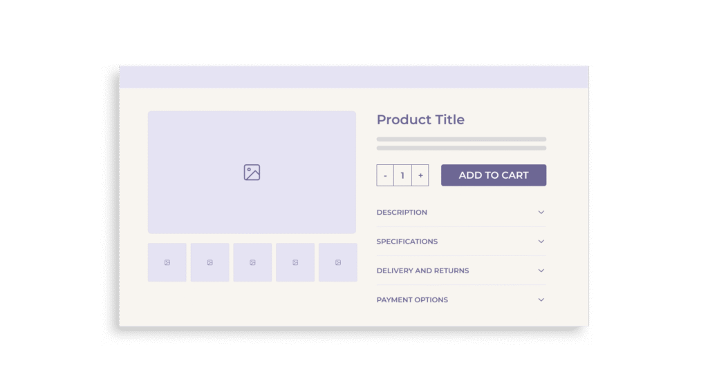
In e-commerce, the product detail page (PDP) serves as the critical decision-making hub for users evaluating a product. Yet despite its importance, one common design pattern continues to interfere with performance across industries: the use of horizontal tabs to structure product information. Although often adopted for their compact visual footprint, horizontal tabs have repeatedly underperformed in usability studies. They obscure key content, introduce ambiguity, and interrupt the flow of product discovery. This article outlines why the horizontal tabs layout is fundamentally flawed, explores more effective alternatives, and provides practical guidance for e-commerce managers seeking to optimize their PDPs for clarity, accessibility, and conversion.
The Hidden Cost of Horizontal Tabs
When horizontal tabs are used to structure PDP content, up to 27% of users completely overlook critical information hidden within them. This means that essential product details like specifications, customer reviews, or return policies may never be seen, leading to increased user frustration and higher bounce rates.
Surprisingly, 28% of e-commerce sites still rely on horizontal tabs despite this proven visibility issue. One reason for their continued use is their visual simplicity, yet this same compactness often results in vague tab labels such as “Info” or “Specs.” These unclear titles force users to guess the content behind them, introducing decision friction and raising the cognitive load.
This lack of clarity contributes to a common behavioral pattern: users spending more time deliberating whether to click a tab and often exiting the page prematurely when the content doesn’t meet expectations. The net effect is a substantial drop in content engagement and a measurable loss in conversion opportunities.
Why Horizontal Tabs Fail Across Industries
The usability shortcomings of horizontal tabs persist across all industries, including fashion, electronics, and B2B. Regardless of whether the product is technical or aesthetic, users consistently miss information that is hidden in tabbed interfaces. Importantly, this behavior is not exclusive to novice shoppers; even seasoned e-commerce users exhibit similar content-overlooking tendencies.
This failure cuts across demographics because it stems from a universal behavior: users are naturally drawn to visible, scrollable content. When key information is concealed behind tabs, it violates this expectation, creating a perception that the PDP lacks depth or transparency. This perception alone can be enough to trigger cart abandonment.
On mobile, the problem intensifies. Tabs often collapse into dropdown menus or carousels, making them even less discoverable. Given that 55%–70% of e-commerce traffic now comes from mobile devices, the impact is significant. Mobile users overwhelmingly prefer vertical scrolling, and horizontally segmented content blocks often escape their notice altogether. The result is a broken information hierarchy that fails to support informed purchasing decisions.
On mobile, the problem intensifies. Tabs often collapse into dropdown menus or carousels, making them even less discoverable. Given that 55% – 70% of e-commerce traffic now comes from mobile devices, the impact is significant. Mobile users overwhelmingly prefer vertical scrolling, and horizontally segmented content blocks often escape their notice altogether. The result is a broken information hierarchy that fails to support informed purchasing decisions.
Superior Alternatives: Quantitative Gains & Layout Options
Replacing horizontal tabs with more visible design patterns has shown significant quantitative gains in usability and conversion rates.
The vertically collapsed section layout, also known as the accordion format, reduces the content-overlook rate from 27% to just around 8%. Unlike horizontal tabs, accordions stack information sections vertically with clear, clickable headers. This format preserves clarity and allows users to access all relevant content without guesswork.
The long page layout with a sticky Table of Contents (TOC) performs even better, with less than 7% of users failing to engage with the content. This structure offers an anchored navigation menu that moves with the user, ensuring all sections are accessible while retaining the natural scroll behavior users prefer. It’s particularly effective for product pages with complex or detailed information.
For minimal products or aesthetically driven categories, a simple long-scroll layout without a sticky TOC can offer 100% visibility. When content is logically structured and visually segmented, users naturally encounter all relevant information during their scroll journey, eliminating hidden content entirely.
These layout alternatives do more than improve user experience; they significantly reduce bounce rates and increase conversion by making content more accessible, intuitive, and engaging.
Implementation Strategy: Data-Driven Rollout
The first step toward eliminating horizontal tabs is a full audit of existing PDPs. E-commerce teams should begin by identifying all instances where tabbed interfaces are used and assessing what types of content they conceal. Important metrics to collect include tab click-through rates, scroll depth, and time-on-page.
Prioritization should focus on high-traffic or high-revenue product categories. For example, if a product category has a 1.8% mobile conversion rate, improving content visibility could lift it to 2.1%. This represents a 0.3 percentage point gain, or a 17% relative improvement in conversions, which can translate into substantial revenue growth at scale.
Layout selection should be tailored to the complexity of the product. For information-heavy products like electronics or furniture, a long-scroll page with a sticky TOC, which typically achieves 92–93% section visibility, is recommended. For moderately detailed products, an accordion layout that captures approximately 92% visibility is suitable. Simpler products can perform well with a clean long-scroll format that naturally provides close to 100% content exposure.
Mobile-first optimization is essential, particularly as mobile e-commerce conversion rates now range between 1.8% and 2.8%, compared to 3.9% on desktop. Each layout must be tested for mobile responsiveness, ensuring that visual hierarchy, interaction clarity, and content segmentation work seamlessly on smaller screens.
Finally, A/B testing is critical. E-commerce managers should run experiments comparing existing tabbed layouts with alternative structures. Key success metrics include increased content engagement, deeper scroll behavior, longer time-on-page, and, most importantly, a measurable uplift in conversion rate. Behavioral analytics such as heatmaps and session recordings can also validate user interaction improvements.
Conclusion & Takeaways
Horizontal tabs have long been a default UI pattern on e-commerce product pages, favored for their neat appearance and space-saving function. However, usability testing and conversion data show that their disadvantages far surpass their visual appeal. Hidden content, poor discoverability, unclear labeling, and friction in user interaction all contribute to missed information and lost revenue.
Fortunately, e-commerce managers have reliable alternatives. Vertically collapsed sections, long-scroll layouts with sticky navigation, and even minimal full-page flows all offer superior usability and greater content visibility. When thoughtfully applied, these patterns support the natural flow of product discovery, reduce return rates, and lift conversion metrics.
Auditing current PDP layouts should be the first step, followed by prioritizing product categories with the highest conversion opportunity. Replacing tabs with visibility-first structures like accordions or long-scroll formats, customizing layouts based on product complexity, and ensuring mobile responsiveness will collectively enhance performance. A commitment to continuous testing will ensure that design changes are not only aesthetic, but also impactful.
By prioritizing clarity over compactness and aligning layout with user expectations, e-commerce teams can create product pages that not only inform but convert – delivering measurable business results across all devices.