User expectations are increasingly visual, immediate, and interaction-driven. Nowhere is this more evident than in how users engage with color variations on product detail pages (PDPs). For millions of online shoppers, color is not a secondary attribute – it is a decisive criterion that can make or break a purchase decision. Whether evaluating electronics, apparel, home décor, or cosmetics, customers intuitively seek to evaluate all available color options before committing attention or intent.
Despite the critical role color plays in purchasing behavior, many e-commerce interfaces still rely on suboptimal selectors such as dropdowns or text-only menus to present color choices. These implementations often hide options, disrupt discoverability, and accidentally introduce friction into the browsing and purchasing flow. Research has shown that users frequently overlook dropdowns, misinterpret color labels, or abandon products prematurely when their preferred color is not immediately visible.
Comparative UX Analysis: Swatches vs. Dropdowns vs. Custom Implementations
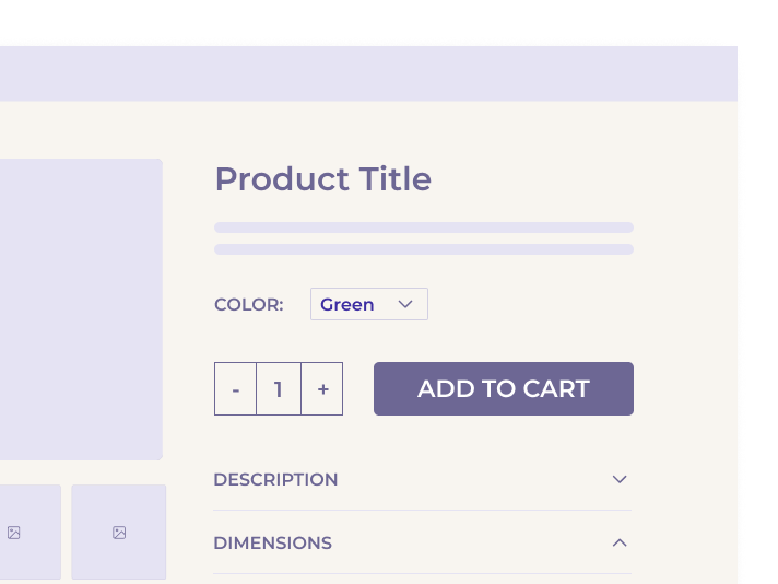
Dropdown Menus
Color selectors presented as dropdowns suffer from a fundamental UX flaw: they offer little visual clue about what options are available. Users must interact with the dropdown before seeing any options, making these selectors easy to overlook entirely. Even when positioned prominently near the “Buy” section, dropdowns were missed by participants who were actively seeking to explore color variations. Worse, dropdowns require cognitive effort to understand textual color names – an especially problematic barrier when those names are creative (e.g., “Sunset”) or culturally ambiguous (“Oxblood,” “Teal”) to international users. This leads to confusion, misinterpretation, or complete disengagement.
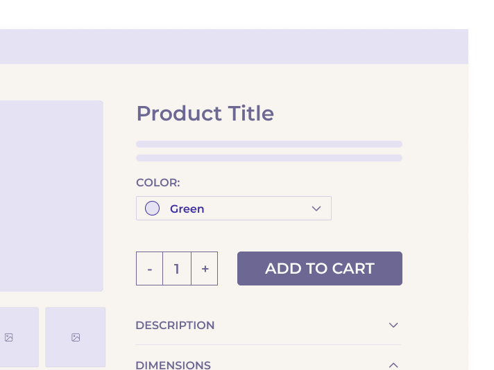
Custom Hybrid Menus
Some e-commerce interfaces attempt to mitigate dropdown shortcomings by embedding swatches within expandable menus or pairing color names with visual cues. While this hybrid approach improves visibility marginally, it does not fully resolve discoverability or comparison limitations. Users still need to open a menu to compare variations, undermining the immediacy and intuitive clarity that swatches provide.
Swatches as the Dominant Pattern
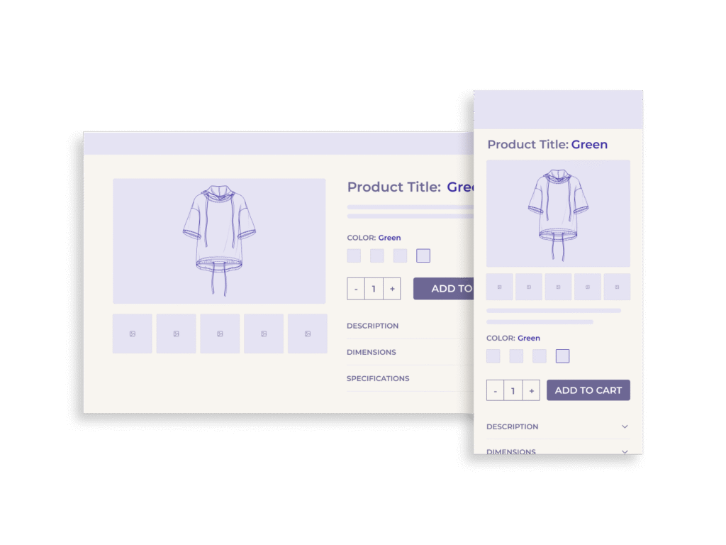
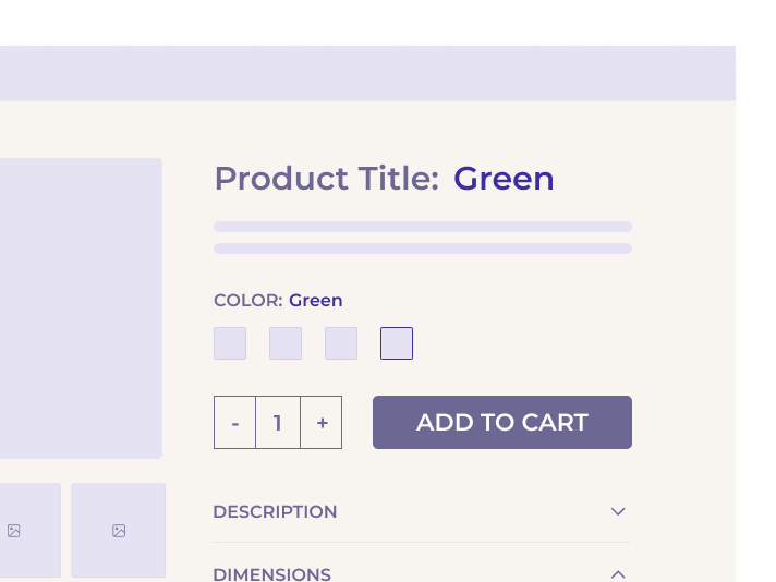
Swatches, by contrast, place color choices directly in the visual foreground. Whether represented by colored dots or thumbnail images, swatches offer immediate insight into the number and nature of available options. Users know instinctively that these are interactive elements, reducing learning time and navigation friction. 80% of desktop sites now use swatches as their primary method for color selection and user behavior validates this trend. In tests where both dropdowns and swatches were available, 75% of participants gravitated to the swatches first.
Swatches also enable more dynamic interactions. For example, linking swatches to the main product image allows for hover-based or click-based previewing, letting users visually compare variations in real time. This tight integration between swatch selection and image gallery further reduces user effort and enhances confidence in product choices.
Accessibility and Implementation Considerations
While color swatches significantly improve usability and discoverability, they must be implemented with attention to accessibility and responsiveness to deliver inclusive, performant experiences across devices and user needs.
Accessibility Guidelines
Visual indicators alone are not sufficient for an inclusive experience. Each swatch should be paired with a clear textual label, either exposed or via ARIA attributes, to support screen readers and assistive technologies. Selection states should also include more than just color or contrast – incorporating outlines, checkmarks, or text indicators to help users with color vision deficiencies or low contrast sensitivity.
Keyboard accessibility is equally critical. Swatches must be fully navigable via tab and arrow keys, with visible focus states and actionable selection via the keyboard. Failing to do so excludes users who rely on keyboard-only navigation and violates WCAG compliance requirements.
Responsive and Mobile Considerations
Mobile interfaces present unique challenges due to constrained viewports and touch-based navigation. When a product has many color options, placing all swatches in a grid can lead to excessive scrolling and visual overwhelm. Instead, a horizontal swipeable carousel – collapsible and expandable – allows users to browse options efficiently without displacing the product image or pushing critical CTAs below the fold.
Touch targets should be a minimum of 44x44px to accommodate tap accuracy. Swatches that are too small or closely packed create frustration and increase the likelihood of selection errors. Additionally, swatch previews should be linked to the image gallery: tapping a swatch should update the main product image to reflect the selected color, and hovering (on desktop) can optionally provide a preview before full selection.
Technical Synchronization
Swatches must be functionally and visually synchronized with the product image gallery and add-to-cart logic. The default color shown in the main image should be preselected in the swatch interface to avoid mismatches or carting errors. This integration minimizes cognitive friction and eliminates the need for error messages such as “Please select a color” when users assume the default image reflects the selected variant.
Cross-Industry Applicability
Why Swatches Aren’t Just for Fashion
While swatches are most commonly associated with apparel and cosmetics, the benefits of visual selectors extend across virtually every product category where color is a variable. From appliances and electronics to home furnishings and automotive accessories, color selection plays a fundamental role in perception and decision-making.
Consumer Electronics
Products like smartphones, headphones, and smartwatches often come in a range of colors. Users expect to see swatches that preview each device in its respective shade, helping them envision how it aligns with personal taste or style.
Furniture and Décor
Home products such as couches, bedding, or lamp shades often have nuanced color differences (e.g., taupe vs. sand). Text-only selectors cannot convey these subtleties. Swatches allow for more accurate comparison and reduce return rates due to mismatched expectations.
Automotive and Lifestyle
Even in industries with high-AOV (average order value) purchases, swatches help convey finish, material, and paint options – particularly when paired with high-resolution product imagery or 3D configurators.
Across all sectors, presenting visual variation selectors meets user expectations, accelerates decision-making, and builds confidence in product selection. The growing widespread use of swatches across verticals makes them a standard rather than an optional enhancement.
SEO, Conversion, and Business Impact
While the usability benefits of swatches are substantial, their impact on key business metrics is equally compelling.
Increased Discoverability, Reduced Bounce Rates
When users overlook available color options – a common failure with dropdowns – they are more likely to bounce, believing the product doesn’t meet their needs. Swatches eliminate this confusion by displaying all options up front, encouraging deeper engagement with the product.
Higher Conversion Rates
Users who can easily compare and visualize color options are more likely to reach a decision and proceed to checkout. Internal studies and usability testing show that swatches not only accelerate the decision process but also lead to greater confidence in selections, which translates to higher add-to-cart rates.
Improved SEO Through Structured Data and Variant Surfacing
Implementing swatches tied to variant URLs or structured data (e.g., Schema.org’s Product schema) allows each color variation to be indexed individually. This enhances long-tail search performance by enabling color-specific queries to resolve to product variants, increasing organic traffic and relevancy.
Reduced Returns
Visual confirmation of color choices reduces customer dissatisfaction and product returns due to unmet expectations. This is particularly critical in categories where color fidelity matters – such as fashion, home décor, and accessories.
Common Mistakes to Avoid
While adopting swatches is a major improvement over dropdowns, several missteps can undercut their effectiveness and, in some cases, reintroduce the very usability issues they were meant to solve.
1. Unlabeled or Non-Descriptive Swatches
Swatches without text labels or accessible ARIA descriptions leave users guessing. Visually similar tones (e.g., “navy” vs. “midnight”) become indistinguishable, especially for users with low vision or color blindness. Every swatch should include both a visible name and semantic metadata.
2. Ambiguous or Unclear Default Selection
If the swatch interface is not preselected to match the product image shown by default, users may believe they’re ordering one color while actually selecting another. This leads to frustration, customer service calls, and preventable returns.
3. Poor Selection States
Swatches must visually indicate which option is selected using high-contrast borders, icons (like checkmarks), or overlays. A subtle shadow or tint is often too understated to be reliable.
4. Overcrowded Swatch Layouts on Mobile
Presenting too many swatches in stacked rows increases vertical scroll depth and can crowd out CTAs and pricing information. For large color sets, a horizontally scrollable container – optionally expandable – is a more efficient pattern.
5. Redundant Dropdowns
Some interfaces include both a dropdown and swatches for the same selection. This adds unnecessary complexity and visual clutter. In testing, 75% of users chose swatches even when both were present, making the dropdown redundant.
6. No Image-Swatch Synchronization
Failing to synchronize swatch interaction with the product gallery degrades the value of visual selection. Users must see how each color changes the appearance of the product – ideally via instant preview on hover (desktop) or on tap (mobile).
Implementation Guidelines and UX Checklist
To ensure swatches work optimally across all user scenarios, follow these implementation guidelines:
Visibility & Placement
- Display all available color swatches above the fold near the primary CTAs.
- Keep swatches visually distinct and intuitively interactive.
Synchronization
- Automatically update the main product image based on swatch hover or click.
- Preselect the color that matches the default image shown.
Accessibility
- Provide descriptive alt text or ARIA labels for all swatches.
- Ensure sufficient contrast and keyboard navigability.
- Design clear focus and selection indicators.
Mobile Optimization
- Use horizontal swipeable containers for large color sets.
- Ensure tap targets are at least 44x44px.
- Avoid pushing key elements (price, buy button) below the fold due to swatch bloat.
Avoid Redundancy
- Do not include both a swatch selector and a color dropdown.
- Maintain consistency in swatch layout and function across product pages.
Grouping (for large color sets)
- Consider categorizing by color family, finish, or pattern when more than 20 swatches are present.
Conclusion
The smallest friction in the buying process can lead to lost revenue. Presenting color variations via swatches – rather than dropdowns or hybrid text menus – is no longer a progressive enhancement; it is a UX baseline.
Swatches immediately convey the range of options available, reduce cognitive load, and align with how users naturally browse and decide. As supported by extensive usability testing, swatches dramatically outperform other selector types in visibility, efficiency, and conversion impact. They are also adaptable across industries and devices when implemented with accessibility and responsiveness in mind.
For e-commerce managers seeking to optimize product detail pages, implementing swatches is a high-ROI intervention with clear benefits: better user engagement, fewer abandoned sessions, and increased purchase confidence.