In the pursuit of optimized conversion flows and seamless online shopping experiences, quantity fields often go overlooked. While seemingly minor, the way users select the number of items they wish to purchase plays a pivotal role in usability, especially on mobile devices. From flexible manual inputs to structured dropdowns and intuitive increment buttons, quantity selection interfaces can either streamline the purchase process or introduce friction that derails it.
E-commerce platforms face a fundamental challenge: presenting quantity fields in ways that are both efficient and contextually appropriate. Should a luxury item like a sofa include a quantity selector at all? How should a B2B platform handle bulk orders exceeding hundreds of units? And does hiding the quantity field ever improve usability?
This article examines the different types of quantity fields used across e-commerce platforms, compares their user experience strengths and weaknesses, and presents evidence-based guidelines for when to include, exclude, or adapt them dynamically. Drawing on usability research, academic literature, and real-world examples – including IKEA’s strategic use of context-sensitive quantity controls – it provides a comprehensive framework for designing quantity selection interfaces that support clarity, efficiency, and user intent.
UX Functions of Quantity Fields
At their core, quantity fields do more than handle transactions – they reflect user intent, guide shopping behavior, and can either strengthen or weaken a user’s confidence in their decision. Their design affects both usability and sales performance.
1. Clarifying Purchase Intent
A well-placed quantity field reinforces the decision to purchase and allows users to express how many units they need without additional steps. This is especially critical in product categories where purchasing more than one item is expected, such as office supplies, food items, or modular furniture. In contrast, requiring a user to adjust quantity in the cart or checkout adds cognitive friction and can lead to abandonment.
2. Minimizing Interaction Costs
Effective quantity fields reduce the number of clicks, keystrokes, or taps needed to complete a task. For example, a stepper with built-in minimum and maximum values that increases the number with each tap allows for quick adjustments while preventing mistakes. On the other hand, fields that rely on full manual entry or open text inputs are more likely to lead to errors, especially on mobile devices with limited touch-friendly space.
3. Preventing Errors and Enhancing Feedback
UX testing has repeatedly shown that users are prone to input errors when quantity fields are poorly configured, such as allowing “0” quantities, non-numeric entries, or quantities exceeding stock. A well-implemented quantity control offers real-time validation, disables invalid inputs, and gives clear error messages, preventing frustration and failed purchases.
4. Shaping Perceived Effort
Even when not used, the visibility of a quantity field contributes to users’ perception of task complexity. On product pages, especially those for single-purchase items (e.g., televisions, premium headphones), a visible quantity input can accidentally signal complexity or lead to unnecessary interaction, as shown in usability testing.
5. Supporting Accessibility and Inclusivity
Accessible quantity fields accommodate users with screen readers, keyboard navigation, and other assistive technologies. Stepper controls, in particular, are helpful when paired with ARIA labels and semantic HTML, whereas freeform text inputs demand more from users with disabilities, often with less predictable results.
Common Types of Quantity Fields (and When to Use Them)
There are several ways users can choose how many items they want to buy. Each type of quantity field has its own strengths and weaknesses. The best choice depends on the product, the user’s device, and how people typically shop on your site.
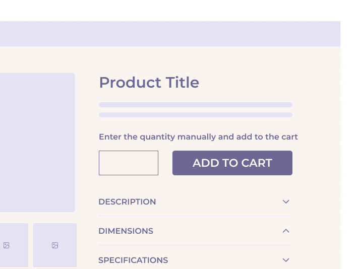
Manual Input Fields
This is the most basic version: a text box where users type the number they want. While it gives people full control, it also invites mistakes – like entering letters or invalid numbers. It’s harder to use on mobile, where typing can be slower and more error-prone. Unless there’s a strong reason to let users enter high or unusual quantities, this type should be used with caution.
Best for: B2B sites or bulk orders where users often enter large or specific numbers.
Avoid when: Most users only buy 1–5 items, or when mobile usability is a priority.
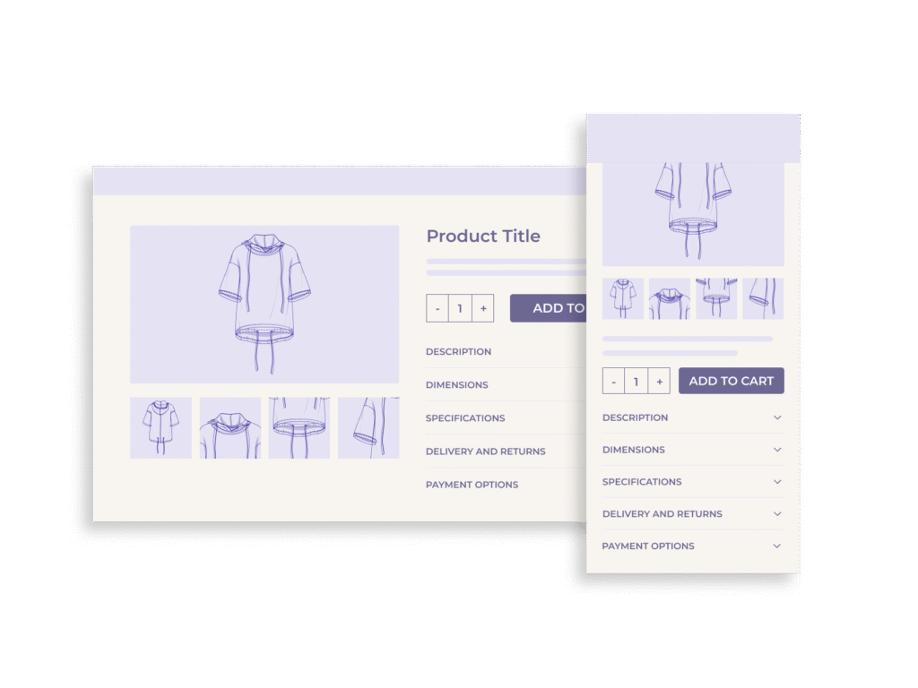
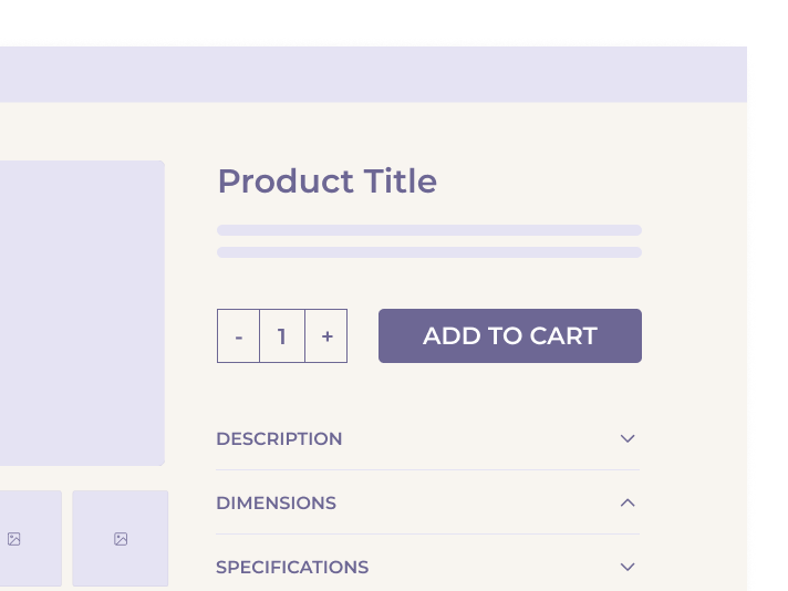
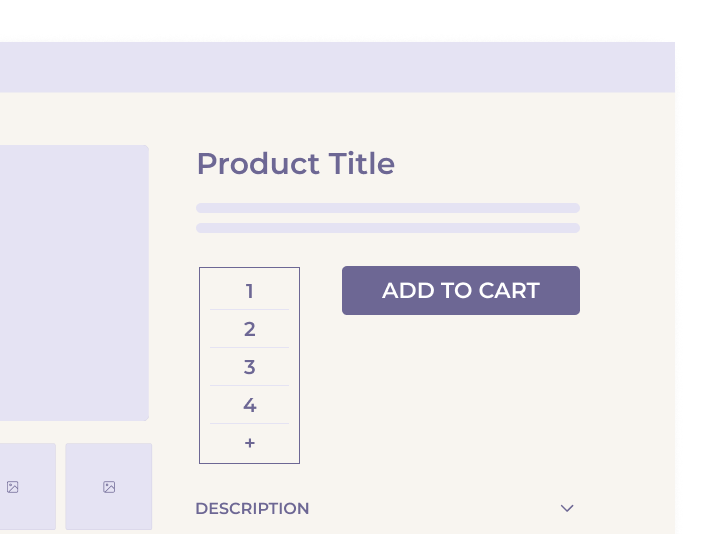
Stepper Controls (+ / – Buttons)
This is one of the most user-friendly options. It starts with a number (often “1”) and lets users increase or decrease it by tapping plus or minus buttons. This design is especially helpful on mobile, where typing is less convenient.
Best for: Everyday consumer products, especially when the quantity is usually small (1–10 items).
Avoid when: Users need to jump quickly to higher numbers (e.g., 75 or 100), unless paired with an editable input.
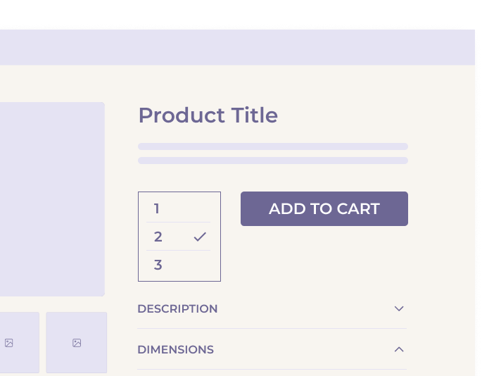
Dropdown Menus
Here, users choose a quantity from a list, for example, 1 to 10. This method prevents invalid input and works well when options are limited and predictable. But it becomes slow and awkward if there are too many choices.
Best for: Products sold in fixed small quantities (e.g., event tickets, bundles, or inventory-limited items).
Avoid when: Users might want to enter more than 10 or when quick entry matters.
Hybrid Controls (Buttons + Editable Field)
This combines the best of both worlds. Users can either use the +/– buttons or type a number directly. If done right, this approach gives speed and flexibility but it needs strong validation to catch errors.
Best for: Sites that serve both casual shoppers and power users (e.g., B2B, wholesale).
Avoid when: Implemented without proper limits or error handling.
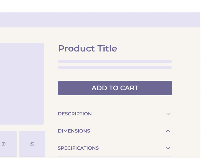
No Quantity Field (Hidden by Default)
In some cases, not showing a quantity field at all is the smartest choice. If users almost always buy just one item (like a TV or sofa), the quantity field can be removed from the product page to simplify the layout. They can still adjust the quantity later in the cart if needed.
Best for: Expensive, large, or one-time-purchase products.
Avoid when: The product is often bought in multiples (e.g., T-shirts, batteries).
When (and Why) to Hide the Quantity Field
While quantity fields are important in many cases, they’re not always necessary. In fact, showing a quantity field at the wrong time can make the buying process more confusing. Usability research shows that hiding the quantity field can actually improve the user experience for certain types of products.
Reducing Visual Clutter
On many product pages, the area near the “Add to Cart” button is already crowded. Adding a quantity field to that space can create a distraction, especially when users are only planning to buy one item, which is often the default. During testing, some users paid too much attention to the quantity field, clicked it out of habit, and got stuck making unnecessary changes. Hiding it removes that obstacle.
Most Users Adjust Quantity Later Anyway
In mobile testing, many users didn’t touch the quantity field at all while shopping. Instead, they waited until the cart page or checkout to change how many items they wanted. This shows that the product page isn’t always the right place to ask for quantity. It’s better to simplify the page and allow adjustments later.
IKEA’s Smart Example
IKEA uses a smart system: for items people often buy in multiples, like chairs or table legs, they show a quantity selector right away. However, for large or expensive items, such as sofas or beds, the quantity field is hidden. This reduces clutter and helps people focus on choosing the right product first.
When Hiding Makes Sense
You should consider hiding the quantity field when:
- The product is typically bought in a quantity of one (e.g., furniture, electronics).
- The design is tight on space (especially on mobile).
- You want to reduce distractions and keep the focus on the purchase decision.
You should keep the quantity field visible when:
- Users expect to buy a specific number right from the product page.
- Products are usually bought in multiples (e.g., stationery, groceries, apparel).
- The business model supports bulk or repeat orders.
In mixed catalogs (with both product types), the best approach is to show or hide the quantity field dynamically based on product type.
Design Considerations Based on Context
Choosing the right quantity field isn’t just about interface design, it’s about matching the shopping experience to the situation. The best choice depends on the type of product, the device being used, and how users typically buy.
Product Type
Different products call for different approaches:
- Single-purchase items: Expensive or large products (like TVs or sofas) are almost always bought one at a time. Showing a quantity field here is unnecessary and may even confuse users.
- Multiples or consumables: Items like batteries, office supplies, or food are often bought in groups. These should have quantity fields visible – ideally with controls that make it easy to add several items quickly.
- Custom or set-based products: When buying a customizable set (like a build-your-own meal kit or furniture set), quantity selection may need to happen later or be embedded deeper in the customization flow.
Device Type
Designing for mobile and desktop requires different thinking:
- Mobile: Space is limited. Controls need to be touch-friendly and simple. Large tap targets (like + and – buttons) work better than dropdowns or freeform fields.
- Desktop: More space means more flexibility. Hybrid controls or editable inputs may be more acceptable here, especially for business or power users.
Purchase Intent
It’s also helpful to think about when and why someone might change the quantity:
- Impulse buys: If users are browsing casually or buying just one thing quickly, don’t overload the interface. A default quantity of “1” is often enough.
- Bulk orders: For businesses or users restocking items, a quantity field with flexible input (or even bulk-edit tools) is a must-have.
- Subscription or repeat purchases: In some cases, it may make sense to show a “preferred quantity” suggestion based on previous purchases or shipping cycles.
Entry Point
Where the user is in the journey matters too:
- Product Page: Keep it simple unless quantity is critical.
- Cart Overlay: This is a good place to let users update quantity after they’ve added the product.
- Cart or Checkout: Always include quantity fields here – this is the last chance to make changes before purchase.
Implementation Guidelines & Best Practices
No matter which type of quantity field you use, the details of implementation make a big difference. A field that’s hard to use, too easy to break, or doesn’t give helpful feedback can cause frustration and lost sales.
Use Smart Defaults
Start users off with a quantity of 1, unless there’s a good reason to suggest more. For example, a B2B supply site might auto-fill a common order quantity like 10. Default values should feel natural and reduce extra steps.
Set Logical Limits
Prevent users from entering invalid values. Every quantity field should:
- Block non-numeric input (e.g., letters or symbols)
- Prevent zero or negative numbers
- Show clear limits if stock is low (e.g., “Only 4 left”)
If you’re using a stepper, make sure the plus button stops at the max allowed quantity and show a message if the user tries to go past it.
Validate in Real Time
Don’t wait until the user hits “Add to Cart” to check for problems. Show errors as soon as possible, for example, if they try to enter “999” when only 20 are available. Use inline feedback that’s easy to read and clearly connected to the quantity field.
Make Mobile a Priority
Mobile users often struggle with input-heavy designs. Use larger touch targets for + / – buttons, avoid small dropdown menus, and don’t force text entry if it’s not necessary. Also consider how quantity fields affect the layout on smaller screens – avoid pushing the “Add to Cart” button too far down.
Ensure Accessibility
Follow accessibility standards:
- Label fields properly (e.g., use aria-label for screen readers)
- Allow keyboard navigation
- Keep the tab order logical
Use proper HTML input types (type=”number”) with care — and test how different devices handle them.
Allow Easy Changes Later
Always let users update quantities in the cart and checkout. Even if the product page hides the field, users should feel in control and able to make changes at any point before buying.
Future Considerations & UX Innovation
While quantity fields might seem like a solved problem, there are emerging patterns and technologies that could make them even more helpful in the future.
Predictive Quantity Suggestions
As more e-commerce sites personalize the shopping experience, quantity fields could suggest likely values based on a user’s past behavior. For example:
- “You bought 3 last time” prompts
- Smart defaults based on order history or frequency
- AI-based recommendations for subscription items or refill products
Context-Aware Adjustments
Just like IKEA adapts quantity fields based on product type, more advanced systems could adjust quantity controls dynamically based on:
- Product dimensions (e.g., large items automatically hide the field)
- Delivery options (e.g., only one item allowed for express shipping)
- Promotions (e.g., auto-setting minimum quantity for bundle discounts)
Visual Quantity Feedback
Some retailers are exploring ways to visualize quantity beyond numbers, for example:
- Dynamic product images that update based on quantity (e.g., showing 3 chairs side-by-side)
- Bundled previews when certain quantity thresholds are met
These design ideas can help users feel more confident in their selections and reduce the chance of errors.
Conclusion
Quantity fields may be small, but they play a key role in guiding user behavior and reducing friction in the purchase process. Whether you’re working with physical goods, digital products, or bulk B2B orders, how and whether you display quantity controls has a measurable impact on UX.
The best approach depends on the context:
- Use simple stepper controls (+/–) for everyday products.
- Offer hybrid or editable fields for bulk or business orders.
- Hide the quantity field for high-cost or rarely-multiplied items.
- Adapt designs for mobile, prioritize error handling, and support accessibility.
- Look ahead to smart defaults, predictive behavior, and visual tools to improve usability even further.
By thinking carefully about quantity field design, e-commerce teams can remove distractions, reduce abandonment, and create a smoother, more intuitive buying experience.
Real time examples
Dropdown Quantity Menus
Target – Uses a dropdown menu on product and cart pages, allowing users to select quantities from 1 to 10.
+ / – Stepper Buttons
Staples – Combines stepper controls with a manual input field, giving users the option to click or type.
LEGO – Features stepper controls on product cards and within the cart for quick quantity adjustments.
Manual Input Fields (Text Entry Only)
Bio&Bio – Starts with a dropdown for quantities up to 6; selecting the “+” icon reveals a manual input field for larger amounts.