On mobile websites, the homepage is often the first thing people see, and it’s where many decide whether to stay or leave. But one common design feature can quickly push users away: the autorotating carousel.
These carousels, sometimes called sliders or rotating banners, automatically scroll through a set of images or promotions. While they may look lively, they often work against mobile users. The screen is small, users are in a hurry, and the moving slides can feel confusing or frustrating. People may miss important content, accidentally tap the wrong thing, or get taken to pages they didn’t mean to visit.
In this article, we’ll explain why autorotating carousels create problems on mobile homepages. We’ll look at research findings, how people behave on small screens, and what makes a better experience. You’ll also learn about smarter design choices that give users more control, improve performance, and help more visitors stay and engage with your site.
Why motion disrupts cognitive flow on mobile
On mobile devices, people scroll quickly, focus on one thing at a time, and make fast decisions. Anything that moves without warning (like an autorotating carousel) can interrupt their thinking and cause them to lose track of what they were doing.
This happens because our brains are wired to notice movement. When something changes on the screen, like a new slide appearing, the brain automatically shifts attention, even if the user didn’t ask for it. On a desktop computer, users can hover a mouse over a carousel to show they’re interested, which sometimes pauses the motion. But on mobile, there is no hover. The carousel keeps rotating, even if the user is trying to read or tap a link.
This can lead to two common problems:
- Interrupted reading – A user starts to read a slide, but it disappears before they finish.
- Wrong tap – A user tries to tap a slide, but it changes at the last second, and they end up on a page they didn’t want.
Even if users recover quickly, these small interruptions add friction. They can make the site feel harder to use or cause people to miss important messages.
Motion isn’t always bad but it needs to be controlled by the user. When content moves on its own, especially on small screens, it can distract more than it helps.
Evidence against mobile autorotation
Usability research shows that autorotating carousels often create more problems than they solve. Especially on mobile devices.
In one set of studies, researchers found that users frequently had negative experiences with rotating carousels. When the slides changed automatically, many users ended up tapping on the wrong thing. For example, they tried to open a product or promotion, but the slide switched right as they tapped, sending them to the wrong page. This led to confusion and frustration. Some users didn’t even realize they were on the wrong page until much later.
Other users didn’t have time to read the slides before they changed. Without a clear way to pause or go back, they simply moved on. This means important content – such as sales, new arrivals, or key features – was often missed entirely.
Even more concerning, when slides took too long to load, users would scroll past the carousel before even seeing the first image. On mobile screens, where space is limited and attention is short, this happens a lot. Many users just skip carousels because they lack the time or trust that they’ll find something useful.
In short, automatic carousels often:
- confuse users with sudden changes
- cause misclicks and detours
- hide important content
- waste valuable space on the homepage
On mobile, autorotating carousels are more likely to hurt the user experience than help it.
Touch-first constraints: Why desktop behaviors don’t translate
Many design patterns that work well on desktops don’t work the same on mobile, and carousels are a good example. One key reason is that mobile devices rely on touch, not a mouse.
On desktop, when someone hovers their mouse over a carousel, it often signals interest and may pause the slide rotation. This gives users time to read or interact with the content. But mobile screens don’t have a hover state. There’s no way for the device to know when someone is focused on a specific slide. As a result, the carousel keeps rotating even when a user is trying to read or tap.
Another challenge is how users interact with mobile screens. Most people expect to swipe through slides. If a mobile carousel doesn’t support swipe gestures and only uses small buttons or dots to change slides, many users won’t realize how to interact with it. This leads to missed content and lower engagement.
Also, the mobile viewport is much smaller. Carousels placed at the top of the page disappear from view quickly as users scroll. That means the chances of someone seeing the second or third slide are much lower than on desktop. If key content is hidden in those later slides, most mobile users won’t see it.
These touch-first limitations mean that mobile carousels must be designed very differently from desktop versions or avoided altogether. What works with a mouse and a large screen doesn’t always work when the only tool is a finger and a few inches of space.
Conversion risk: How autorotation leads to frustrated journeys
When users feel confused or out of control on a website, they’re more likely to leave, and less likely to buy, sign up, or take any action the site wants. This is one of the biggest problems with autorotating carousels on mobile: they often create frustration early in the user journey.
Imagine a user tapping what they think is a product or promotion only to land on a completely different page because the slide changed mid-tap. Even if they realize the mistake and go back, the experience already feels clumsy. For others, the detour isn’t even noticed right away, which means they end up reading content they didn’t mean to access. This weakens trust and adds confusion.
Even when users aren’t misdirected, fast-moving slides often don’t give them enough time to read or decide. Important offers or messages may go unseen, or feel too rushed to be taken seriously. Users may scroll past the carousel without interacting at all, especially if it looks like an ad or feels hard to control.
All of this adds friction – small moments of struggle that add up to big drops in engagement and conversion. When users are unsure, distracted, or annoyed, they’re less likely to take the next step. In testing, sites that removed or redesigned carousels often saw improvements in both usability and key performance metrics like click-through rates and bounce rates.
Performance & accessibility issues of carousels
Autorotating carousels don’t just create usability problems. They can also slow down your site and make it harder to use for people with disabilities.
Performance slowdowns
Carousels often rely on extra scripts, animations, and large image files. On mobile devices (especially those with slower connections or older hardware), this can lead to longer load times. If the homepage takes too long to load, users may leave before they even see the carousel. Google’s research shows that 53% of mobile visitors will leave a site that takes more than three seconds to load.
Also, large carousels can negatively affect your Core Web Vitals, especially:
- Largest Contentful Paint (LCP): if a big image in the carousel is the largest visible element, it slows down LCP.
- Interaction to Next Paint (INP): heavy scripts from carousels can delay how fast the site reacts to taps or scrolls.
These slowdowns not only frustrate users but can also hurt your search rankings.
Accessibility problems
For users who rely on screen readers, carousels can be confusing. If the content changes automatically, it may be skipped or not read properly. Users with motor impairments may have trouble using small controls like arrows or dots, especially if they aren’t clearly labeled or visible.
Motion itself can also be a problem. For people with vestibular disorders or sensitivity to motion, auto-rotating content can cause discomfort or dizziness. That’s why accessibility standards like WCAG recommend giving users full control over animated content. If something moves, the user should be able to pause, stop, or control it.
In short, autorotating carousels often break important accessibility rules and create extra technical weight – both of which reduce the overall quality of the site.
Hidden content and SEO pitfalls
One major downside of carousels (especially on mobile) is that they often hide important content. This creates problems not just for users, but for search engines too.
Content that’s hard to find
In many carousels, only one slide is visible at a time. If users don’t swipe or tap through the slides, they won’t see the rest of the content. And on mobile, most people don’t. Research shows that very few users view past the first or second slide, and some scroll past the entire carousel before it finishes loading.
If your homepage depends on users seeing those later slides to learn about a product, a promotion, or a key feature, that message may be completely missed. This means less engagement, fewer clicks, and a higher chance of lost sales.
SEO risks
Carousels can also make it harder for search engines to read your content. If the slides are loaded with JavaScript or only appear after the page is fully loaded, Google may not index them. That means your content won’t show up in search results even if it’s relevant and valuable.
On top of that, if important text or links are hidden in later slides, they may not be given as much weight by Google’s mobile-first indexing system. This can lower your search visibility and weaken the overall SEO performance of your homepage.
To improve both user experience and SEO, it’s better to place key content directly on the page where it’s easy to see, read, and crawl without relying on motion or hidden elements.
What to do instead: Effective, mobile-optimized alternatives
If autorotating carousels don’t work well on mobile, what should you use instead? The good news is that there are better options – design patterns that are more effective, more user-friendly, and easier to manage.
Option 1: Use Static Content Blocks
One of the simplest and most reliable solutions is to replace the carousel with static content blocks. These are fixed sections on the homepage that highlight important promotions, product categories, or features without moving.
Users are already used to scrolling on mobile. With static blocks, they stay in full control of what they see and when. There’s no rush, no confusion, and a much better chance that users will actually engage with the content. You can still use strong visuals, clear headlines, and calls to action, just without the motion.
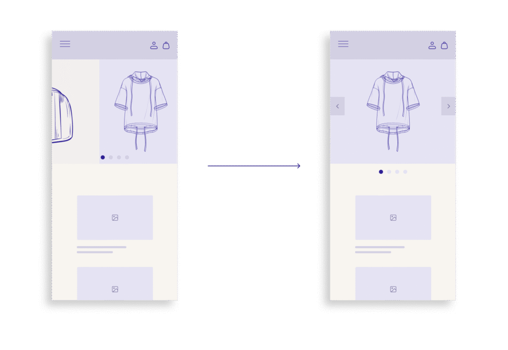
Option 2: Use Manual Carousels (With Caution)
If you decide to keep a carousel, make sure it doesn’t rotate on its own. A manual carousel, where users swipe or tap to see more, can work if it’s well designed. But it should follow these key rules:
- Don’t hide important content – Never rely on a carousel slide as the only way to access something important. If it matters, it should also appear somewhere else on the homepage or in the navigation.
- Support gestures – Make sure users can swipe naturally on mobile, not just tap tiny arrows or dots.
- Make text readable and controls clear – All text must be easy to read on small screens, and carousel controls must stand out visually.
- Keep it fast – Slides should load quickly, with no lag or delay.
Option 3: Use visual navigation blocks
Instead of a carousel, consider using grid-based visual blocks—like a set of large buttons or cards with images and short text. These are easy to tap, fast to load, and help guide users to key areas of your site. They’re also better for accessibility and indexing.
These alternatives give users control, reduce frustration, and make your homepage faster and more effective. And they’re proven to perform better across usability studies and mobile analytics.
Implementation blueprint: From design audit to deployment
If your current mobile homepage uses an autorotating carousel, the first step is to evaluate how it’s working—and whether it’s really helping users. Here’s a step-by-step approach to improve or replace it.
Step 1: Audit the current carousel
- What’s in the slides? Make a list of all the content featured in your carousel. Is it time-sensitive, important, or repeated elsewhere on the page?
- Are users interacting with it? Use analytics to see how many people are clicking on each slide. If most clicks go to the first slide or there are very few interactions overall, the carousel likely isn’t doing its job.
- How fast does it load? Run performance tests on mobile devices. If the carousel delays page load time or affects Core Web Vitals, that’s a strong reason to remove it.
Step 2: Identify key content that needs visibility
- What are the top priorities? Decide which promotions, categories, or messages are most important for users to see right away.
- Can this content be shown more clearly? Think about how to surface this information without relying on motion or hidden slides.
Step 3: Redesign the homepage layout
- Replace with static blocks or visual sections. Use full-width banners, content cards, or image-based buttons.
- Organize content by priority. Put the most important content higher on the page.
- Use clear headlines and strong visuals. Guide the user with simple, well-labeled blocks that make tapping easy.
Step 4: Test for usability and speed
- Check mobile gestures and tap areas. Make sure every element works naturally with touch.
- Test on real devices and networks. Use slow connections to simulate real-world mobile usage.
- Validate accessibility. Use accessibility tools to confirm that all content is readable and easy to navigate for all users.
Step 5: Measure post-launch results
- Track engagement with new homepage elements.
- Compare bounce rates, click-through rates, and conversions before and after the change.
- Listen to user feedback and make small improvements based on real behavior.
Removing or replacing a mobile carousel is more than a design tweak. It’s a chance to make your site faster, clearer, and easier to use. This process helps ensure that change leads to real improvements in experience and performance.
Conclusion & key takeaways
Autorotating carousels may seem like an easy way to show more content in a small space, but on mobile homepages, they often do more harm than good. They confuse users, slow down pages, hide important content, and create accessibility issues. Most importantly, they take control away from users just when it matters most.
People want simple, fast, and predictable experiences on mobile. They want to scroll, tap, and explore content at their own pace. Autorotation works against all of these expectations.
What you can do instead:
- Replace carousels with static content blocks that highlight key messages.
- If you use a carousel, make it manual, no auto-rotation, and easy to swipe.
- Avoid hiding important content in slides. Make sure it’s visible elsewhere on the page.
- Focus on speed, clarity, and control to improve both user experience and business results.
By removing autorotating carousels, you’re not just simplifying your design, you’re making your mobile homepage smarter, faster, and more welcoming to every visitor.