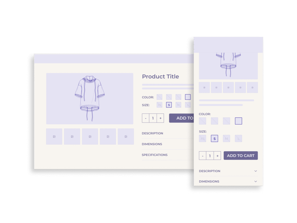
Product variations, such as size, color, or material, play a critical role in shaping the user experience. But what happens when only one variation remains? Should the interface still display a selector, or should it be replaced with plain text to streamline the user’s path to purchase?
Some usability guidelines suggest removing the variation selector altogether when no actual choice remains. They argue that presenting a selection interface with only one option misleads users, wastes time, and can trigger unnecessary friction in the shopping flow. This view prioritizes speed and simplicity.
However, this approach may conceal more than it reveals. When selectors are removed, users lose visibility into what options exist but are temporarily unavailable, such as niche sizes or rare configurations. This can diminish trust, create false impressions of product limitations, and exclude users with specialized needs. For merchants seeking to serve a broad audience, this trade-off deserves closer examination.
Why This UX Decision Matters
The presence, or absence, of a variation selector sends a strong signal about a product’s availability and versatility. For example, consider a shopper looking for a size XXS in a T-shirt. If the size selector is removed because only one size is in stock, the user may assume that other sizes were never offered. This not only leads to confusion but potentially drives away high-intent shoppers who simply needed assurance that their size exists, even if it’s temporarily unavailable.
Moreover, variation selectors act as navigational anchors across product lines. Users come to expect a consistent interface that reflects the brand’s full inventory – even if certain SKUs are momentarily out of stock. When these elements disappear, users are left wondering whether the store carries the variations they need or if they’ve simply been overlooked.
The Case for Removing Variation Selectors
Some UX practitioners argue that if only one variation is available – such as a single size or color – the selector should be removed entirely. Instead, the chosen value should be displayed as static text. This approach reduces interface complexity and eliminates an unnecessary interaction, especially on mobile devices where tap targets and screen space are limited.
From a usability testing standpoint, users encountering a dropdown or button-style selector instinctively assume a choice must be made. When they open the selector and find just a single option, the experience often leads to hesitation or confusion. In some cases, users may even receive error messages prompting them to “select” the only option – wasting effort on an action that should have been implicit.
There’s also a consistency argument. Maintaining a minimalist interface by displaying only what’s actionable aligns with broader UX principles like progressive disclosure. By stripping out elements that no longer serve a functional purpose, the product page becomes cleaner and more goal-focused.
Advocates for this approach emphasize speed, efficiency, and reduced decision fatigue. When implemented well, it allows users to progress through the buying journey without distraction or doubt.
The Case for Keeping Variation Selectors
While simplicity has its benefits, removing the selector can also remove critical information, especially for users who fall outside the average use case. When only one option is shown and no selector is visible, there is no indication that other options ever existed or may return. This is particularly problematic for users with specialized needs, such as uncommon sizes (e.g., XXS, 4XL), rare colorways, or region-specific configurations.
In these cases, variation selectors function not only as interface controls but as indicators of product scope. Their presence (especially when paired with greyed-out or disabled options) lets users know what the brand normally offers, even if something is temporarily out of stock. This communicates both capability and consideration.
Moreover, leaving the selector in place enables features like “Remind me when available” buttons or stock alert signups. Instead of hitting a dead end, users are invited to engage further, giving merchants a chance to recover lost sales and gather intent data.
There’s also a psychological component: users tend to trust interfaces that are transparent about limitations. Showing unavailable options reinforces that your store is honest, inclusive, and aware of diverse customer needs. This is especially important for brand perception in fashion, footwear, and cosmetics – industries where exclusion of certain body types or tones carries social and emotional weight.
Real-World Compromise Patterns
In practice, the best solution often lies between total removal and full persistence. Hybrid approaches can preserve transparency while minimizing user friction.
One common pattern is to keep the variation selector visible but disable unavailable options. For instance, sizes that are out of stock may appear greyed out or crossed through. To enhance this further, pairing each unavailable option with a “Notify me when available” link or button allows users to express intent without disrupting the primary purchase flow. This not only retains clarity but turns an unavailable product into a data-generating opportunity.
Another strategy is to visually separate available and unavailable options. Some interfaces group current choices at the top and list out-of-stock variations below, marked clearly. This reinforces that other options exist and may return – without cluttering the interaction with inoperative controls.
Tooltip-based explanations are also useful. Hovering over or tapping an unavailable option can reveal messages like “Expected restock in October” or “Limited run – no longer available.” These microinteractions help manage user expectations and reduce frustration.
Importantly, these compromise patterns also allow for future flexibility. If inventory levels change, the selector is already in place and doesn’t need to be reintroduced. The user interface can adapt dynamically without rewriting the structural layout of the product page.
When It Does Make Sense to Remove the Selector
Despite the benefits of retaining variation selectors, there are legitimate scenarios where removing them is the more appropriate choice.
The most clear-cut case is when the product variation is permanently the only option. If a product has never supported additional sizes, colors, or formats – and never will – then a selector offers no functional or informational value. In such instances, displaying the static value (e.g., “Color: Charcoal”) as plain text avoids unnecessary interface elements without hiding any important context.
Similarly, if a product is being phased out and only one configuration remains, streamlining the interface may be justified, especially if the rest of the site does not offer back-in-stock notifications or long-tail size tracking. Here, clarity and simplicity support the natural end-of-life of the product line.
Other exceptions include platforms or storefronts where the backend infrastructure doesn’t support dynamic variation handling. If showing unavailable options causes logic errors, loading issues, or analytics anomalies, maintaining a fully dynamic selector may create more problems than it solves.
Finally, for fast-moving inventory models such as flash sales or limited-run drops, removing unavailable options entirely may reduce cognitive overhead in time-sensitive contexts. In these cases, the goal isn’t long-term transparency but short-term speed and conversion efficiency.
In summary, the key question is not simply “how many options are left?” but “what does the presence or absence of the selector communicate to the user and is that message truthful and helpful?”
Implementation Best Practices
Designing variation selectors that balance transparency, clarity, and performance requires careful execution across both the front-end and back-end. The following practices help ensure selectors function reliably while enhancing the overall user experience.
1. Preserve Visual Clarity with Intelligent Grouping
If you’re displaying both available and unavailable options, clearly differentiate them. Use visual cues like greyed-out text, strikethroughs, or iconography (e.g., an “X” or “Out of stock” badge) to signal unavailability. Position available options first to reduce scanning effort.
2. Pair Unavailable Options with Actionable Alternatives
Where possible, allow users to act on out-of-stock variants by including “Notify Me” or “Remind Me” CTAs. These tools not only reduce frustration but also offer opportunities to collect email addresses, improve forecasting, and recover missed sales.
3. Ensure ARIA and Accessibility Compliance
Selectors should clearly communicate status changes to screen readers. Use appropriate ARIA attributes (e.g., aria-disabled, aria-live) to denote disabled states or updated stock availability. Avoid masking variation status in ways that only visual users can perceive.
4. Avoid Redundant Selection Logic
If only one variation is available, avoid requiring users to actively select it before proceeding to checkout. Preselect the option by default or pass the value silently, ensuring a frictionless path to conversion.
5. Support Dynamic Inventory Changes Without Page Reloads
Where practical, use AJAX or SPA logic to update selectors dynamically as inventory data changes. Prevent full page reloads when users interact with variation selectors, particularly if their action leads to no visible change.
6. Align Front-End Display with Back-End Inventory
Inconsistencies between the user interface and real-time stock can create user distrust. Ensure the variation logic is synced with up-to-date inventory data and reflects temporary unavailability accurately.
Conclusion & Recommendations
The decision to remove or retain variation selectors when only one option remains is not merely a matter of interface cleanliness – it’s a strategic UX choice that directly affects user trust, discoverability, and inclusivity.
While some usability philosophies advocate for removing single-option selectors to streamline interaction, this can backfire by concealing important contextual information. For users seeking niche or uncommon variants, the absence of a selector may falsely signal that their preferred options were never available. This diminishes transparency and potentially alienates high-intent shoppers.
Instead, preserving the variation selector (even when only one option is active) can serve multiple purposes: it communicates the full scope of your offerings, reinforces brand credibility, and opens pathways for engagement through waitlist or back-in-stock features.
In summary:
- Keep the selector if other variations are temporarily out of stock or might return.
- Show disabled options clearly, with visual and semantic cues.
- Provide actionable CTAs like “Remind me when available” to convert user frustration into retention.
- Only remove the selector when there truly is no other variation – past, present, or future – and when removing it won’t diminish context or clarity.